third space brewing
brand system
Third Space Brewing came to us for packaging design that was uniquely them. In our early conversations they expressed the need for designs that felt like a family, but still left room to give each new release its own look. We defined their need for a robust and flexible design system.

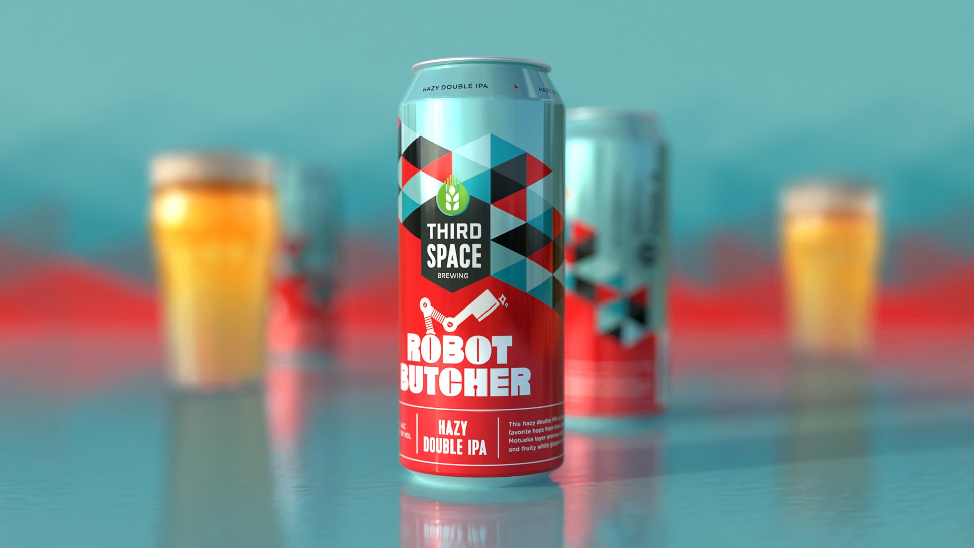
We suggested the idea of incorporating a consistent element to unify all the designs and establish a distinct visual identity. Enter the triangle motif. This triangle pattern serves as the foundation for all Third Space Brewing designs. Its stability provides a solid base, allowing us to explore creativity in other aspects. Additionally, each core beer release receives a unique treatment for its name. This variation adds freshness and generates anticipation for every new release.

Having established a robust system, the process of designing packaging and related materials becomes effortless for everyone involved. The solid structure we developed ensures that the brand is instantly recognizable on store shelves. A massive win in a crowded market.
Throughout the past six years, we have been delighted to witness the evolution of Third Space Brewing's brand system as they continue to expand. We have intentionally created space to accommodate exciting limited releases and new core beers, allowing for ongoing innovation and growth.

